PLAYING WITH FIRE
BRANDING

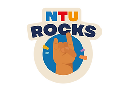
The 'Playing with FIRE' visual identity was carefully crafted with purpose. I aimed to emulate our values of knowledge, empowerment, & balance within the campaign logo.
Our logo features a torch, a universal symbol of knowledge, enlightenment & hope. I paired this with a navy blue for trust & stability, & a vibrant orange that screams excitement, yet danger. Together, they reflect our dual messaging– that FIRE can be dangerous, yet when contained properly, can empower. As complementary colours, they reflect balance.

Branding Across
Campaign


Website, Social Posts (excluding reels), Collaterals are all designed by me


Pull-up Banner

A1 Poster Boards


Brochure

Centy Standee

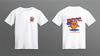

Campaign T-Shirts


Newspaper Activity
PANEL EVENT


Event Images


Card Conversations Game
Sticker Sheet
Centy Stamp
Mascots are a powerful tool for memorability, enhancing emotional bonds & making learning engaging. Centy does exactly that for FIRE. Our primary research showed that 45.2% of our respondents find the finance community intimidating.
To combat this, an animated little Singaporean 5-cent coin was born. Centy exemplifies the financial struggles that many young adults face while navigating financial independence. By tying him to a common object, the TA gets a tangible reminder of their FIRE journey whenever they see a 5-cent coin, keeping financial mindfulness top of mind.
Meet

Centy!
Centy The Singaporean 5-Cent Coin
design
projects

UNIVERSAL MUSIC GROUP
Adhered closely to the organisation's & repertoire owners' brand guidelines while maintaining visual consistency across all platforms. I worked on 4 decks, over 60 social posts, EDMs, & various print collaterals for multiple promotional events over the course of 6 months.
I focused on clarity, brand alignment, & audience engagement when working on my designs. This sharpened my ability to adapt to different visual identities while working within tight deadlines. I’ve also included brief descriptions for each design to provide insight into my creative decisions & technical considerations.


Promotional post for Taylor Swift's 'The Tortured Poets Department' album release. Concept: a breakdown of tough lyrics from the new album.

Promotional post for Taylor Swift's 'The Tortured Poets Department' album release. Concept: a breakdown of tough lyrics from the new album.

Going Y2K whimsy in this concept of Katy Perry, as 'Wide Awake' comes back full force as a trending audioclip. Here I push her back catalogue albums to get fans nostalgic & promote streaming.
Promotional post for Taylor Swift's 'The Tortured Poets Department' album release. Concept: a breakdown of tough lyrics from the new album.

Poster for Billie Eilish's 'HIT ME HARD AND SOFT' listening party event

Poster for Taylor Swift 'The Tortured Poets Department' listening party event

For Olivia Rodrigo's 'SOUR' 2 Year Anniversary
Poster for Billie Eilish's 'HIT ME HARD AND SOFT' listening party event
YA KUN FAMILY CAFÉ

I designed all collaterals with a warm, family-friendly theme in mind—keeping the tone conversational, approachable, & easy to resonate with across generations.

'LOVING THE ASIAN WAY'

For my Integrated Marketing Communications module, my team selected Ya Kun Kaya Toast as our brand of choice. From our primary & secondary research, we discovered that many respondents were unaware of the difference between a regular Ya Kun outlet & a Ya Kun Family Café.
Eventually we settled on a 2-pronged strategy.


-
Food truck
-
Influencer marketing
-
Social media ads/posts
-
Press release
-
AR filter
-
Kaya Convos [card game]
-
OOH bus stop ads
-
YouTube Ads
-
Instagram/Facebook Ads
-
AR filter


We sought to position Ya Kun as the go-to family café for parents who may not be openly expressive, but value quality time & convenience when spending time with their loved ones. With its wider menu offerings & heartland locations, Ya Kun Family Café stood out as a convenient, accessible choice for everyday family bonding.
Thus, we brought about our big idea: 'Loving the Asian Way'.
other
designs
CAMPAIGNING
FOR PUBLICITY DIRECTOR
I ran for my Hall of Residence's Publicity Director position alongside my roommate. Instead of going for the usual posters around the dorms, we designed our own cereal boxes & placed them in high-traffic areas – the pantries!


We received positive feedback and encouragement from those who had seen our cereal boxes. We were even more flattered that many people (strangers even) wanted to take our boxes home!

BRINGING LIFE TO THE DEAD
STORIES FROM AN EMBALMER

“The body is not a table, you have to treat it with respect.”
- Carl Consulta
I never expected to come face-to-face with an embalmer at 20. Frankly, I thought my first meeting would come much later in life. But what a blessing it was, to learn about the simple art of living from Carl Consulta, an embalmer at The Life Celebrant (TLC).
I had the honour of being an interviewer, editor, photographer, & illustrator for the site. My main focus was to strike a balance between visual storytelling & maintaining respect when conveying Carl's stories regarding the deceased.


WKWSCI x TORONTO
#ICA23
Wee Kim Wee School of Communication & Information requested photo booth prop designs for the 2023 International Communication Association (ICA) Conference held in Toronto. The ICA is an opportunity for students & academics to mingle and celebrate their outstanding achievements in the research sector.